✶ Strategy ✶ Concept development ✶ Illustration ✶ Branding
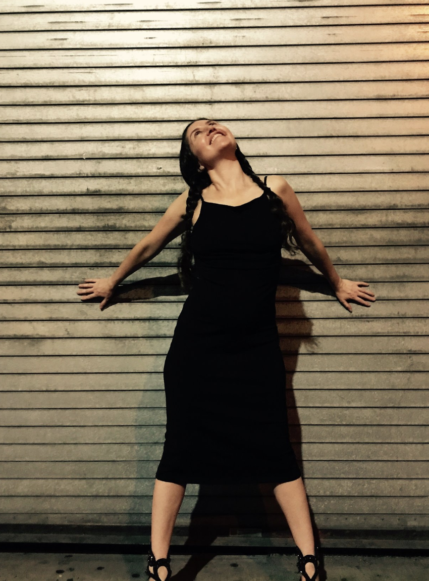
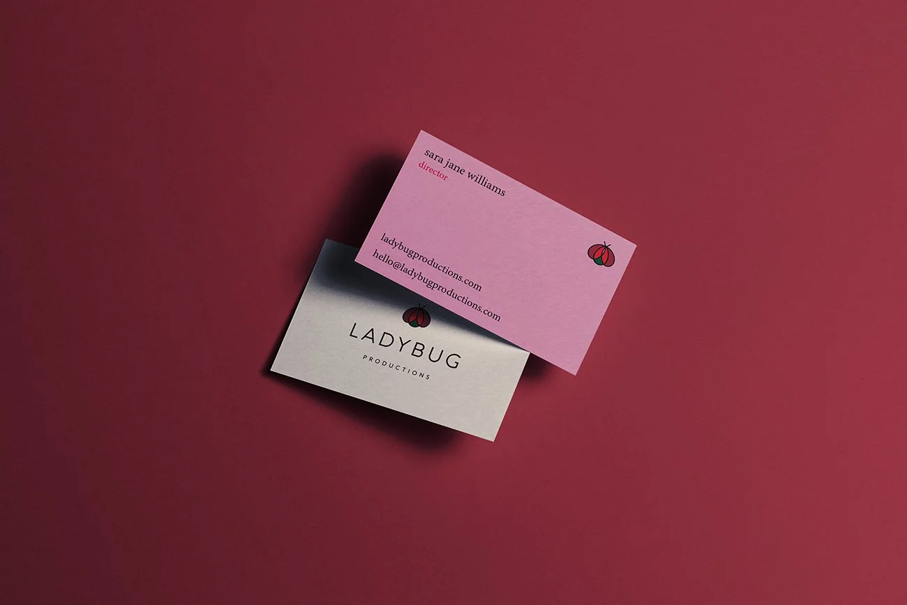
Sara Jane wears many hats—she is an energy facilitator, matchmaker, somatic practitioner, and stand-up comedian, just to name a few. She owns a multi-disciplinary company called Ladybug, and currently uses a ladybug image as her business symbol.
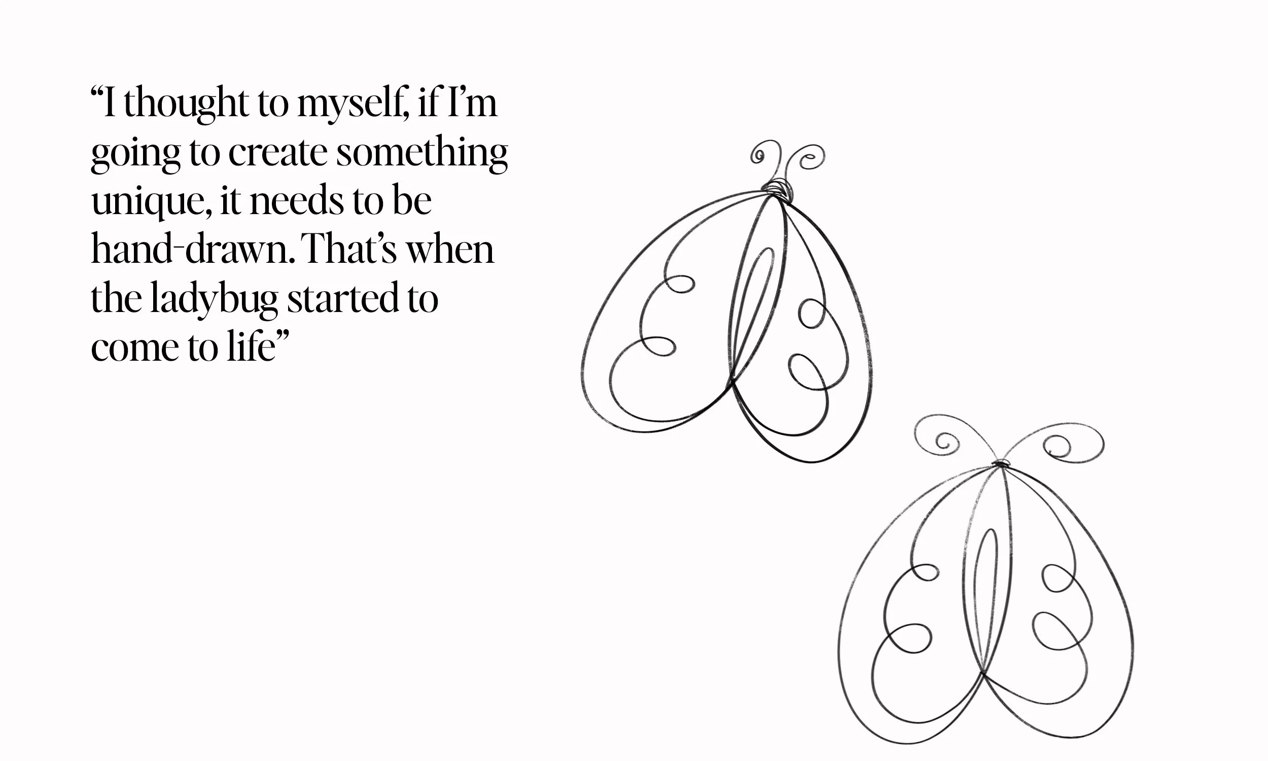
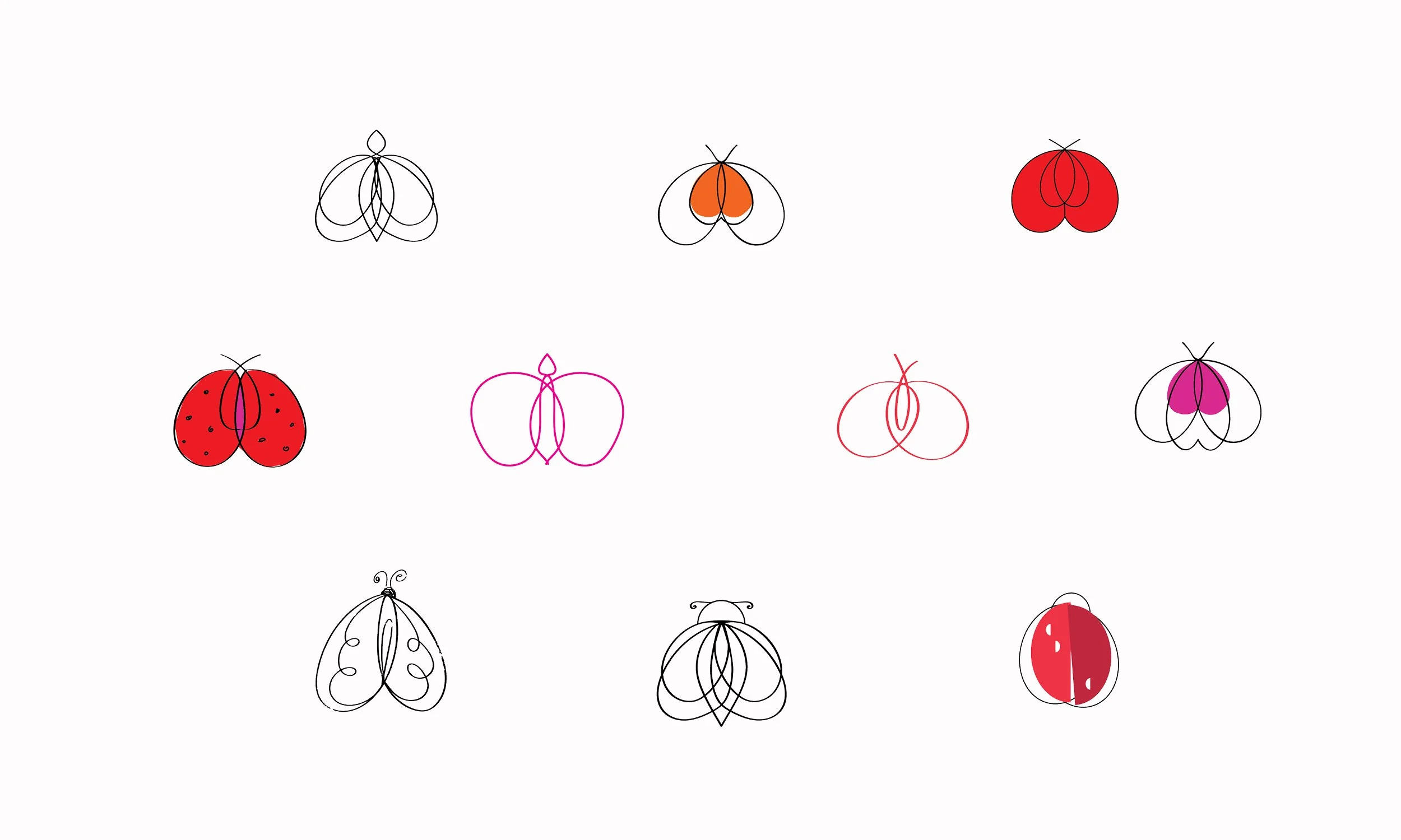
Sara Jane feels it’s time to take this symbol to the next level, and to do so, she needs a more professional look. She has decided to move forward with creating a logotype that represents her company.
Ladybug Productions currently includes: The Living Blog; Caress; Access Consciousness; Romantic Matchmaking; Independent Staffing Services; Mediation, Conflict Transformation, & Bias-Awareness; Professional Writing; Art; Somatic Experiencing Practitioner (SEP); Certified Moksha/Modo Yoga Instructor; Renaissance Woman.
THE BRIEF
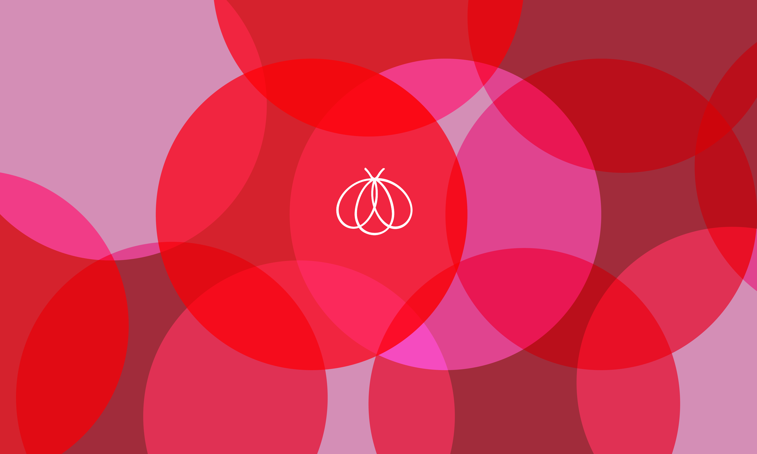
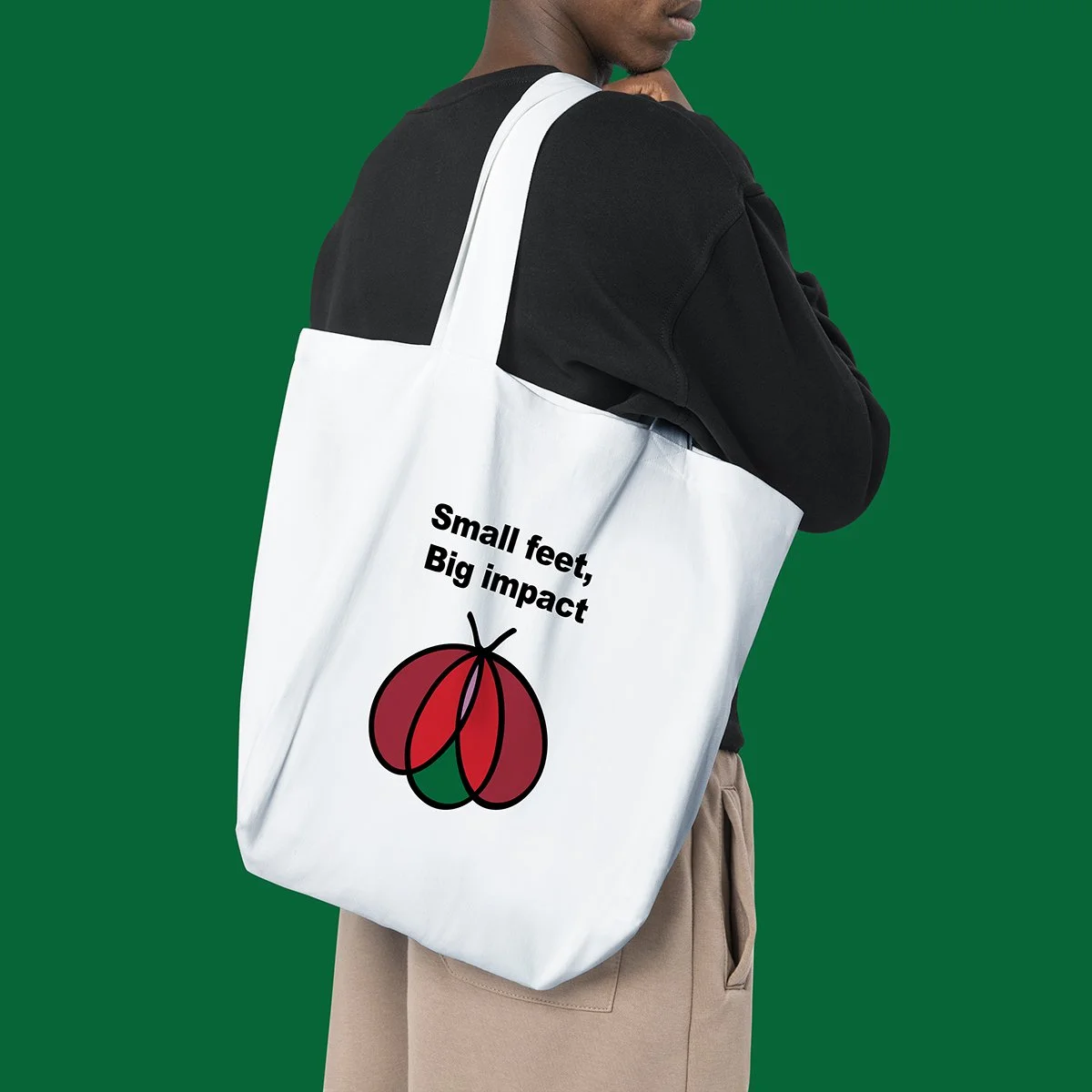
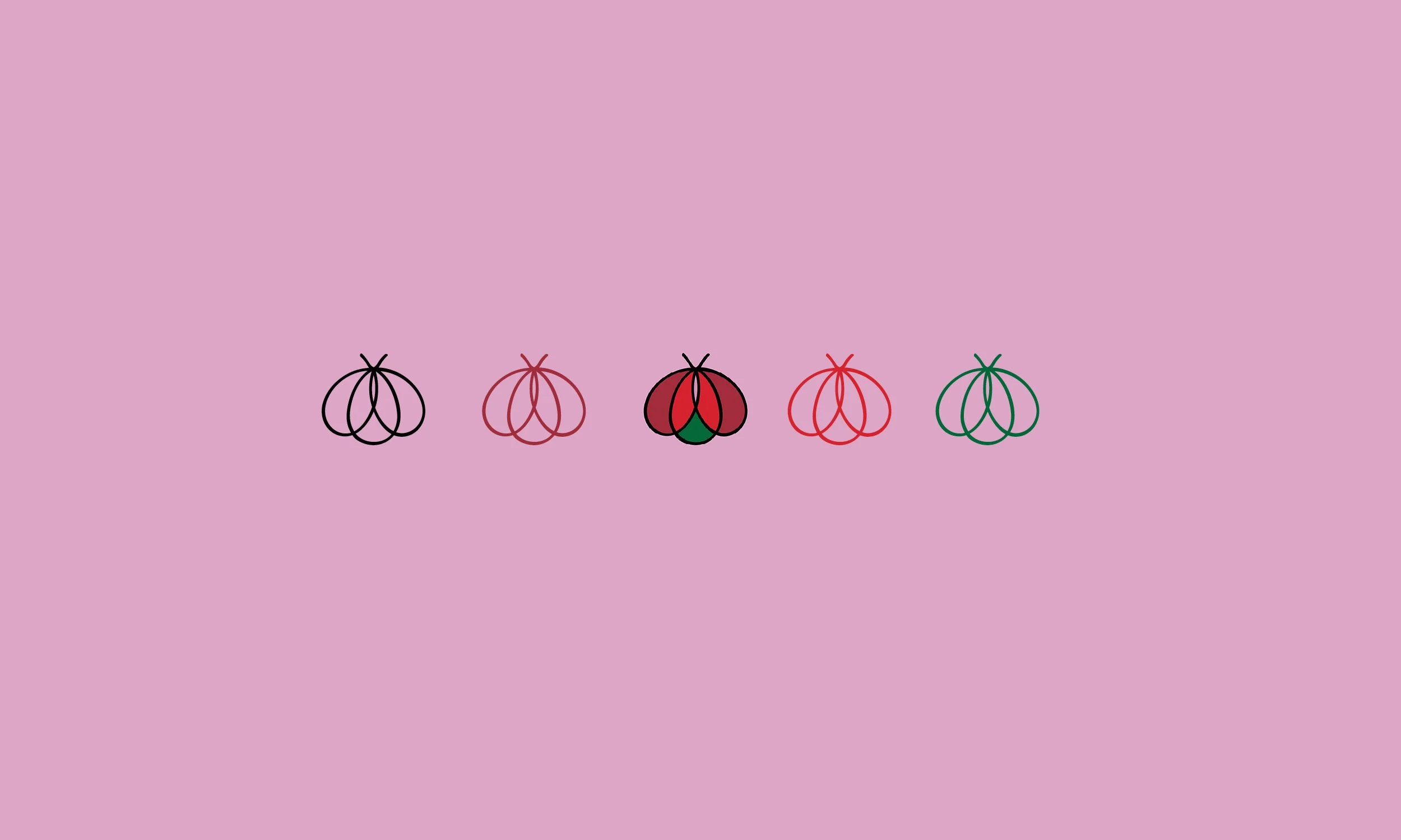
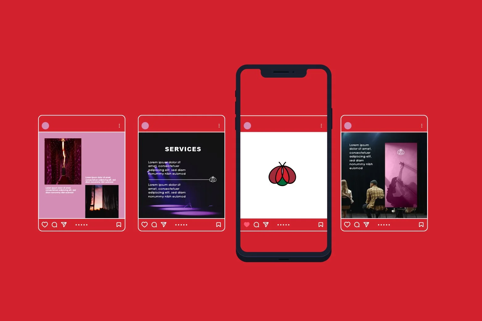
Ladybug productions is based in NYC and is a company that transform and expands as Sara Jan does, the brief was to create a logo that translates the innate nature of the ladybug, their lovely look and at the same time their “fierce” qualities. Some of the characteristics that the logo must communicate are eroticism, joy, lightness, ease, brightness, fun, money, attraction, intrigue, potency, glistening and transformation.
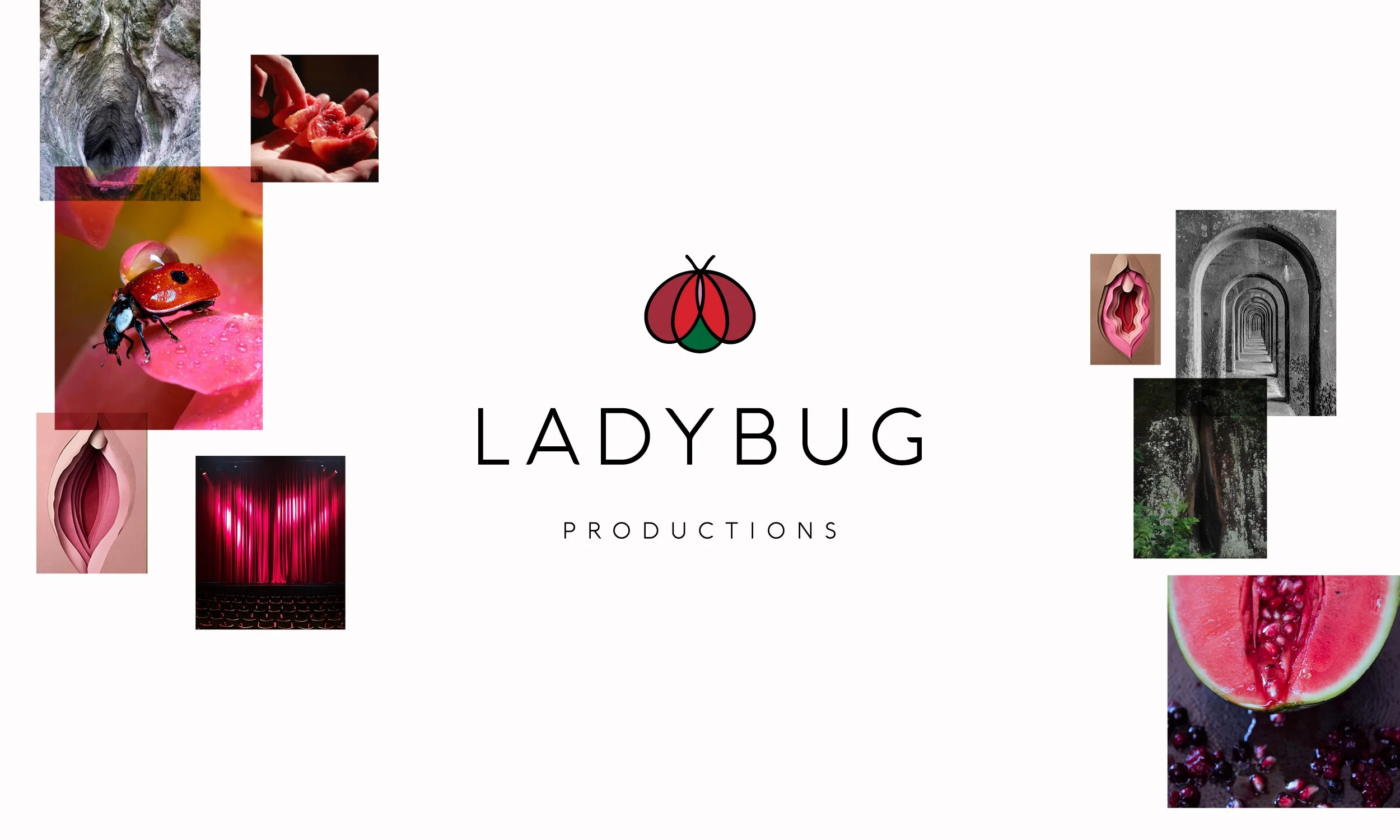
A happy client!
-
![Sara Jane design client]()
☆☆☆☆☆
“Vanessa is truly gifted! She tapped into the energy of the business and created an image which matches and exceeds what I am creating. In other words, the logo Vanessa made for Ladybug Productions, Inc. is multi-layered, multi-dimensional, and it it captures the past, present, and a bright future. The business has many aspects and she was able to convey so much, while keeping it simple and sophisticated. I teach clitoral stroking classes and the logo is reminiscent of a vulva. I also have an ongoing performance piece and the very same image reflects the curtain, stage, spotlight. Vanessa is smart, insightful, professional, reliable and friendly. I truly enjoy her approach and I benefited immensely from the experience. Highly recommend. She is very skilled in design and beyond. Excellent communication, respectful and forthright feedback, quality offerings. I am very impressed and grateful!”
—Sara Jane Wellock