✶ Strategy ✶ Concept development ✶ Branding ✶ Visual Direction
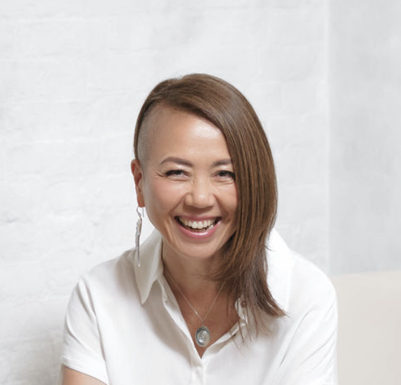
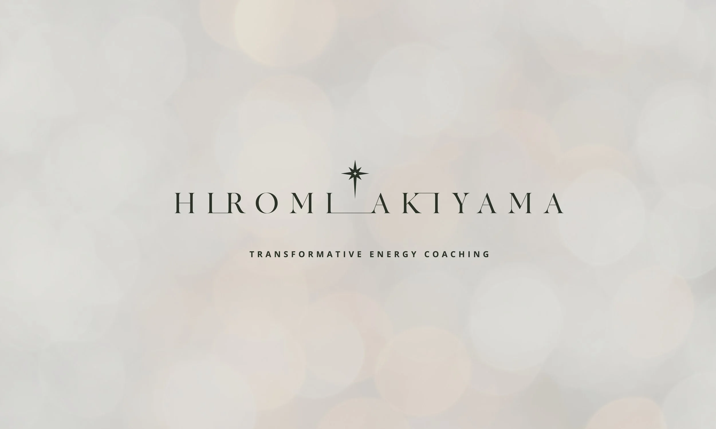
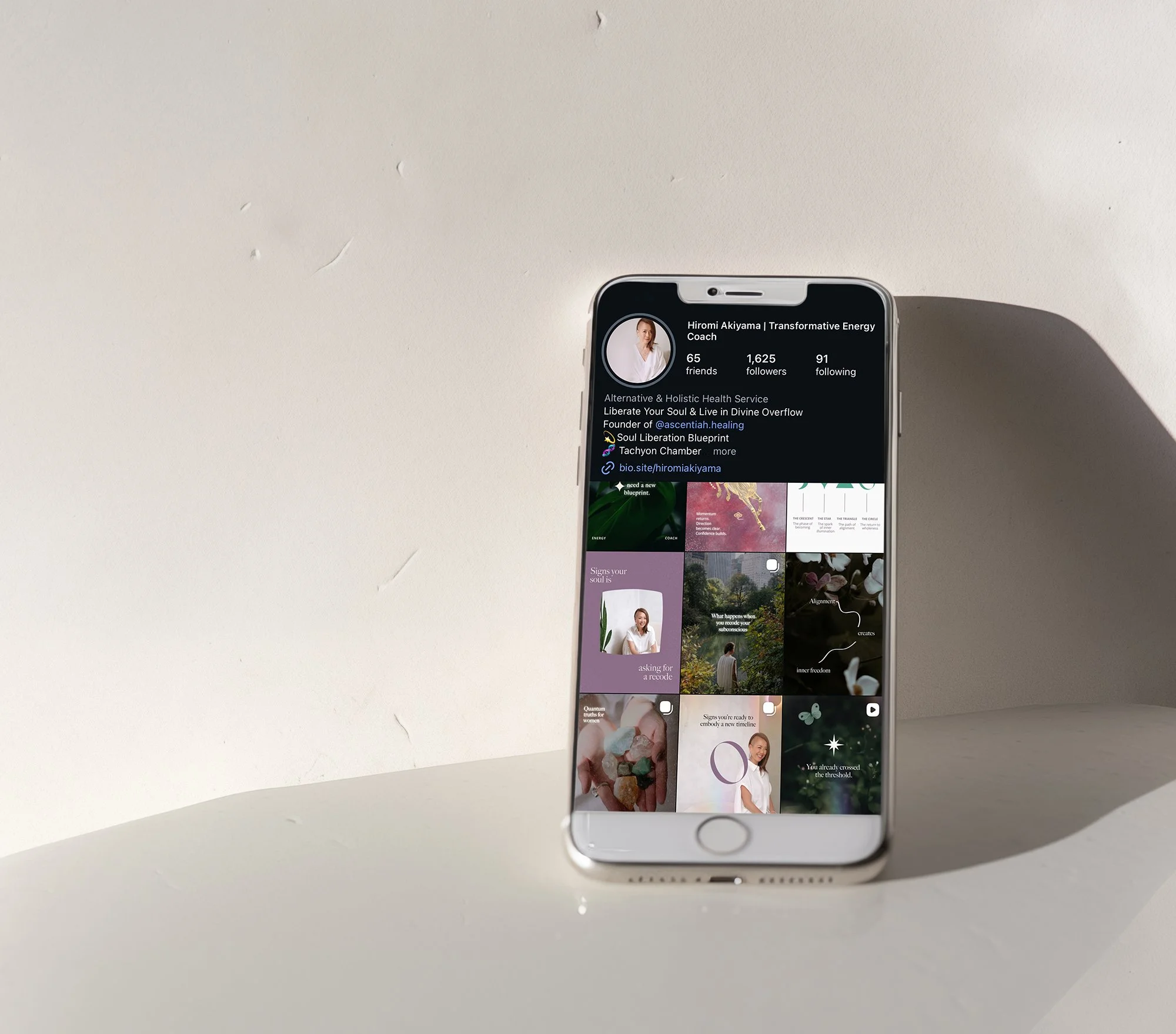
Hiromi Akiyama is a coach and practitioner of multidimensional energy healing modalities, devoted to supporting individuals in overcoming limitations, healing emotional trauma, and experiencing deep, lasting transformation. Her work guides clients toward embodying their highest self and a sense of true soul liberation.
Blending ancient spiritual wisdom with advanced quantum technologies, Hiromi facilitates profound energetic shifts that support alignment, expansion, and inner clarity. Her mission is to create a safe and sacred space where individuals can heal, reconnect with their inner power, and move toward liberation.
Hiromi is also the founder of Ascentiah Healing Center in NYC.
THE BRIEF
Hiromi envisioned a brand rooted in sacred geometry, designed to exist alongside Ascentiah Healing Center while standing as her own distinct identity as founder and guide.
The direction needed to balance expansion and empowerment with a sense of grounding, refinement, and trust. At the same time, the brand would hold a subtle softness—airy, luminous, and gentle—without leaning too feminine, overly spiritual, or esoteric. The intention was to reflect Hiromi’s connection to higher realms in a sophisticated and accessible way, avoiding anything overly galactic, whimsical, or shamanic.
The brand also needed to bridge quantum spirituality with a more corporate audience—inviting those who may not yet know this work, but feel drawn to its depth and potential.
THE CONTEXT
I met Hiromi while I was a practitioner at Ascentiah Healing Center, where I offered my ‘Sobada’ womb massage sessions. When she discovered that I was also a brand designer, she felt called to work with me as she recognised that I understood her work and the way she sees the world.
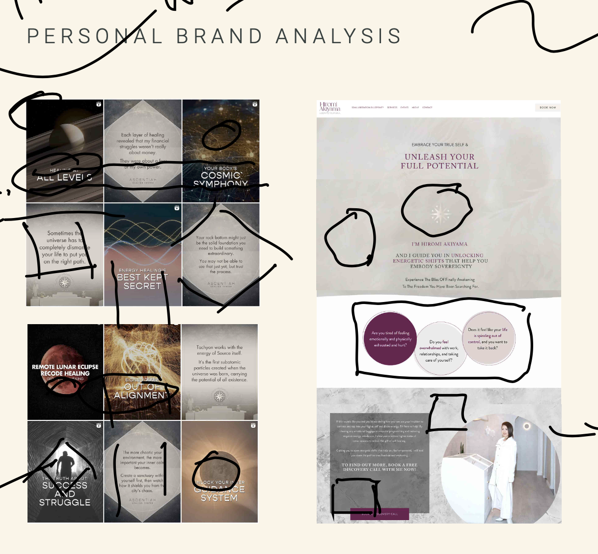
Hiromi initially booked a 1:1 Brand Clarity Coaching session to identify gaps in her visual strategy, and overall presence. Below, you’ll see key insights that emerged from analysing her existing brand.
Following this session, she chose to move forward with a full rebrand and visual direction.
How we started
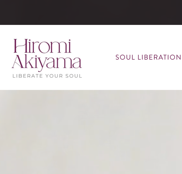
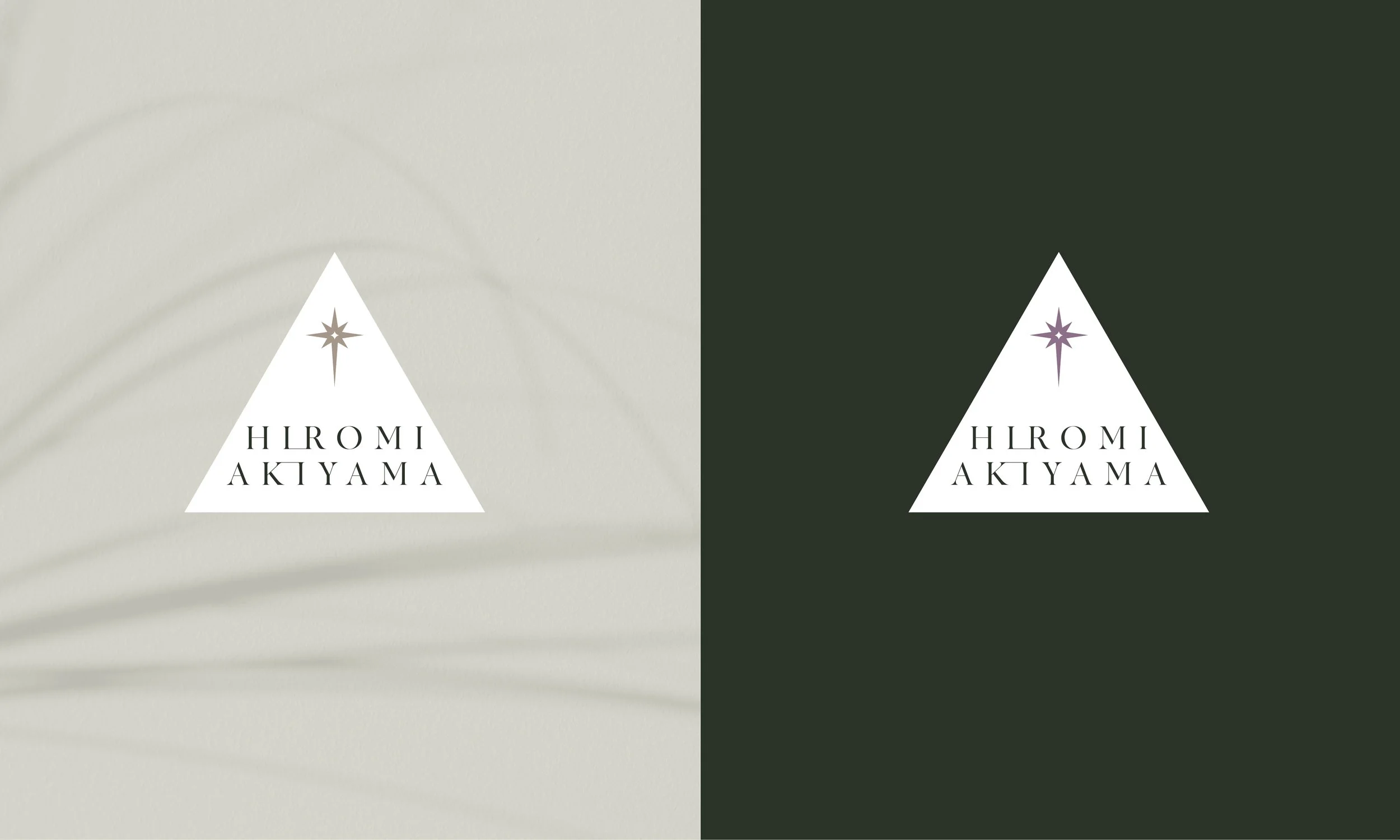
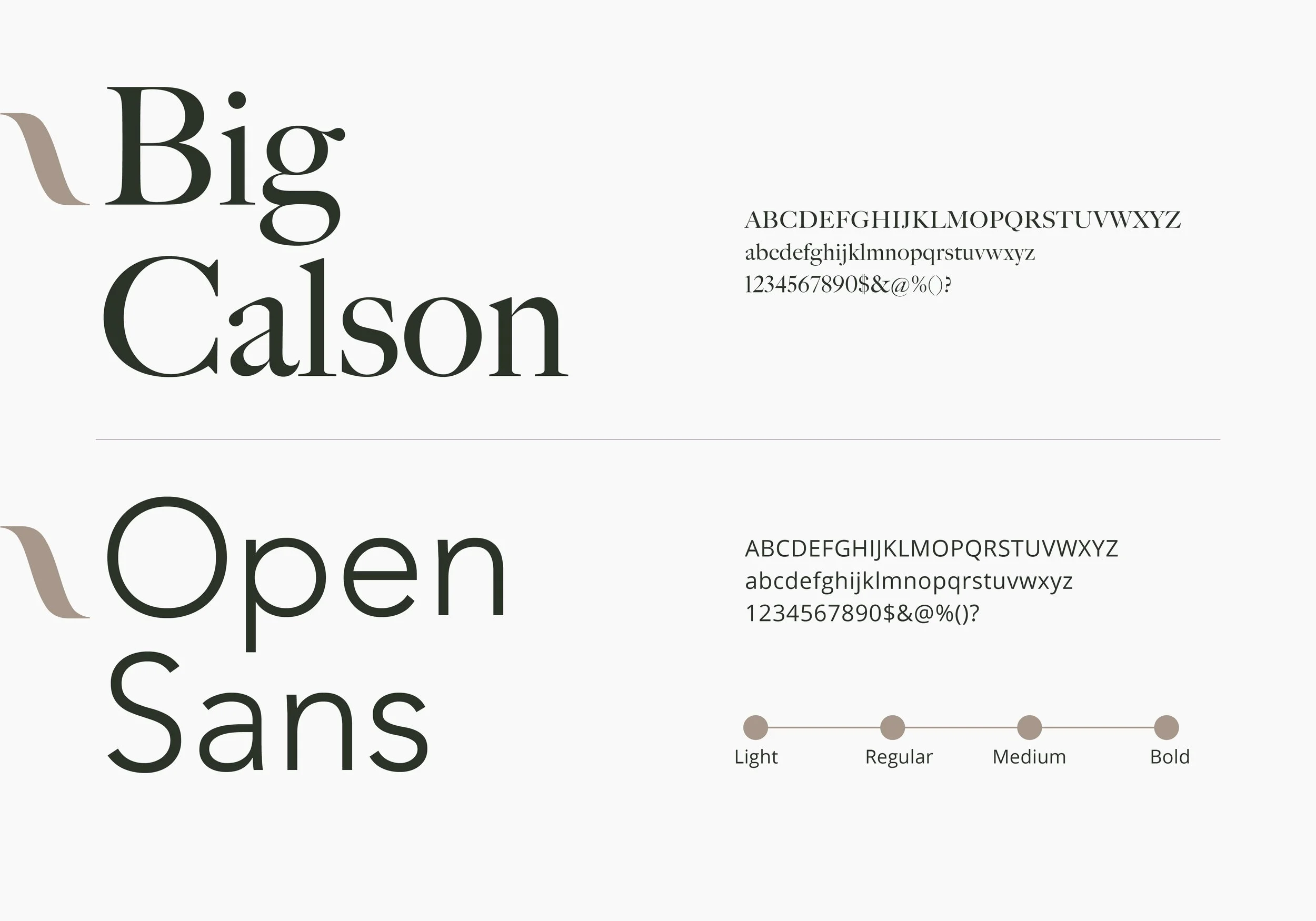
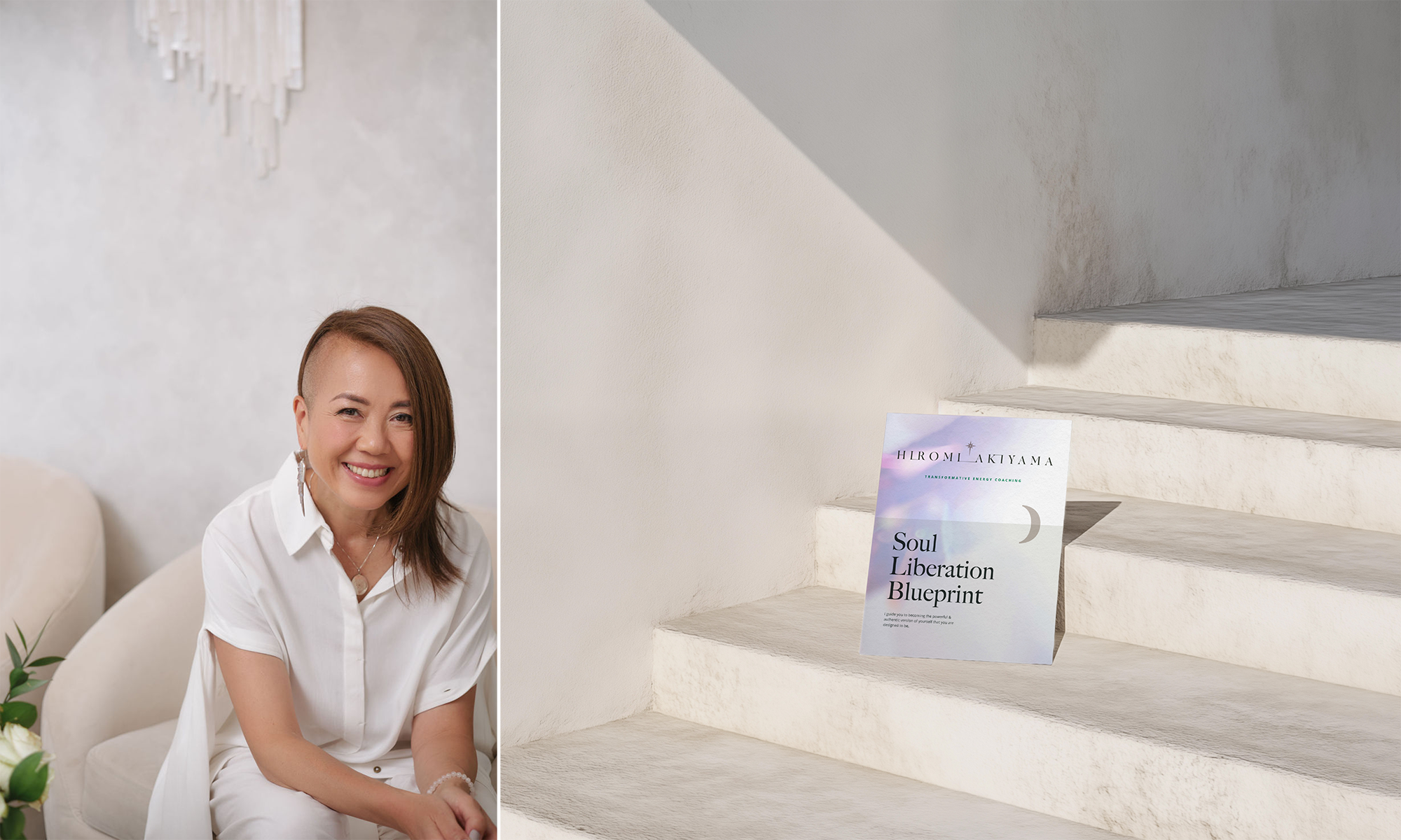
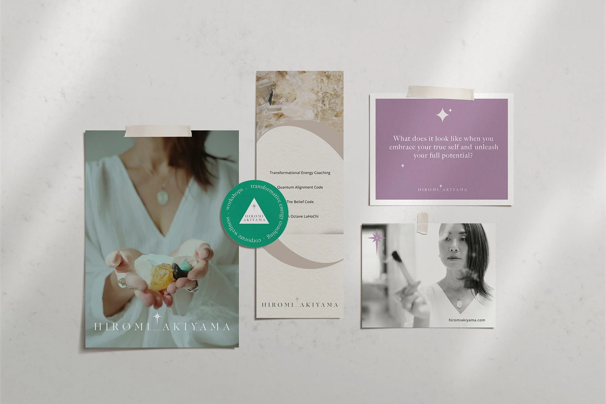
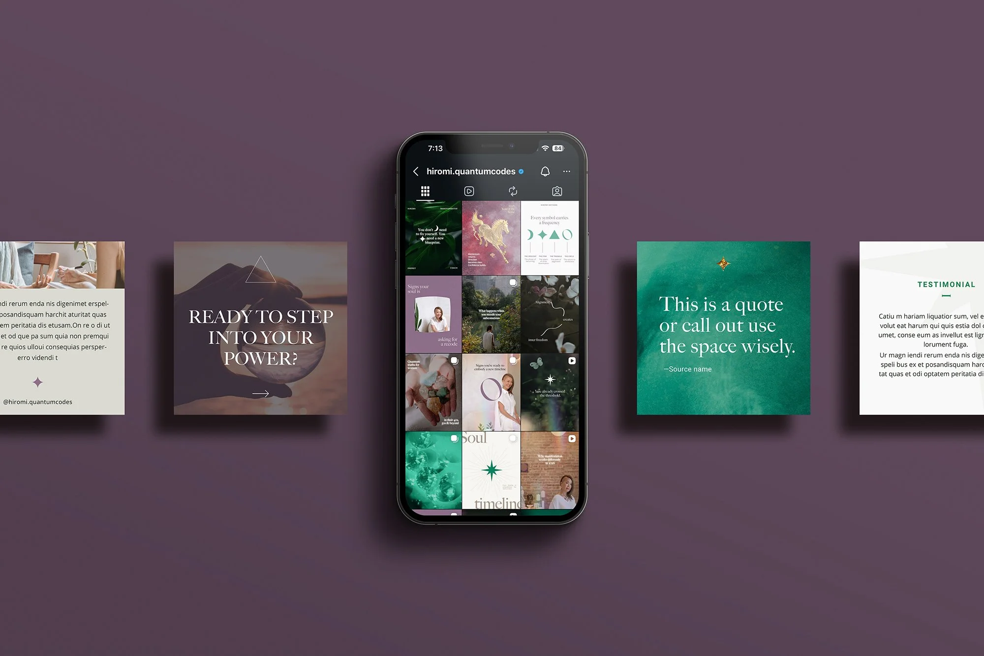
The logo
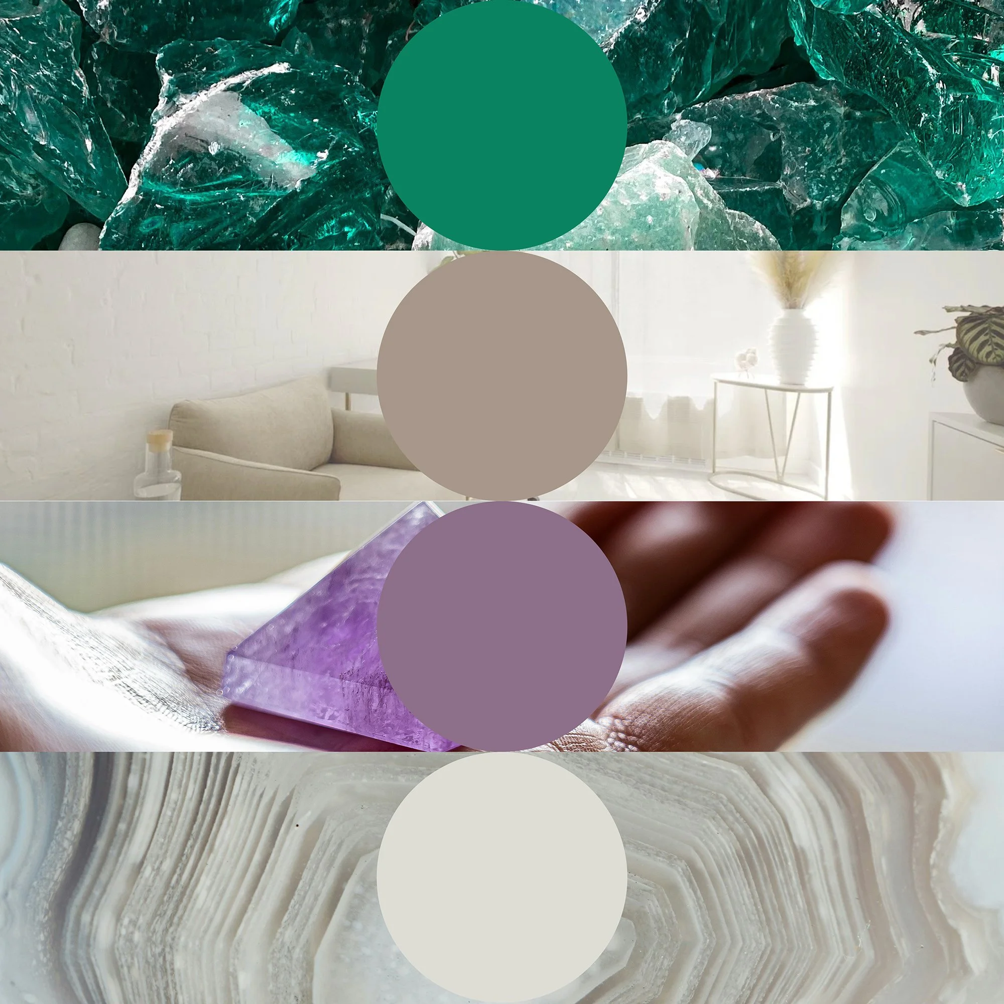
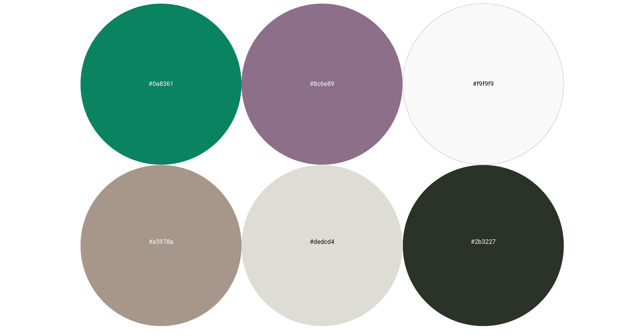
The visuals and palette colour
The photography
The rebrand
I love when clients know what they want—and what they don’t want. Sometimes, it’s even easier to begin by defining what’s not aligned.
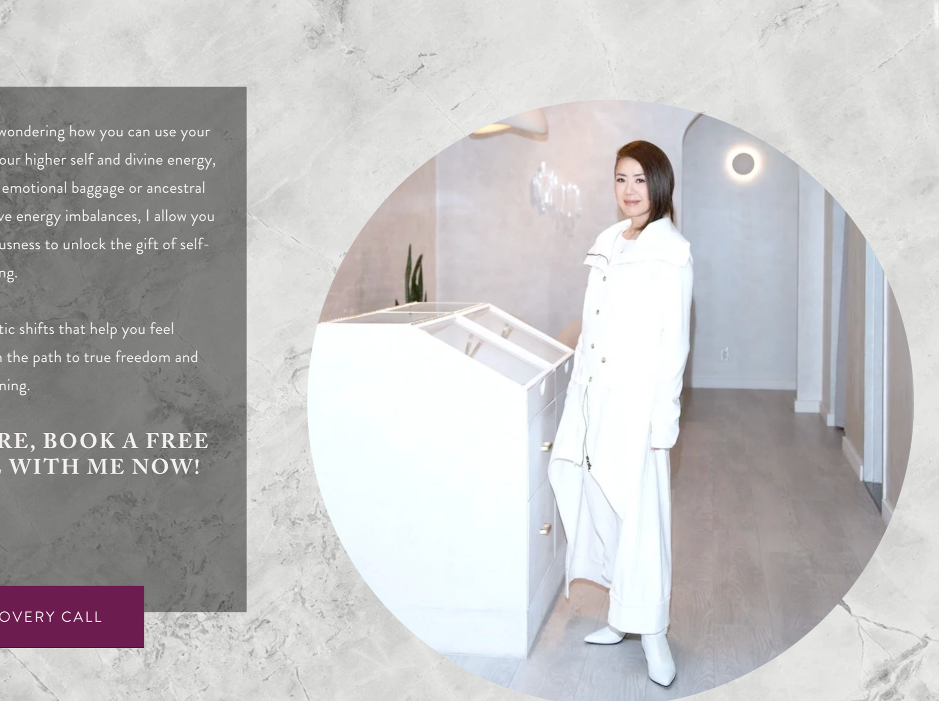
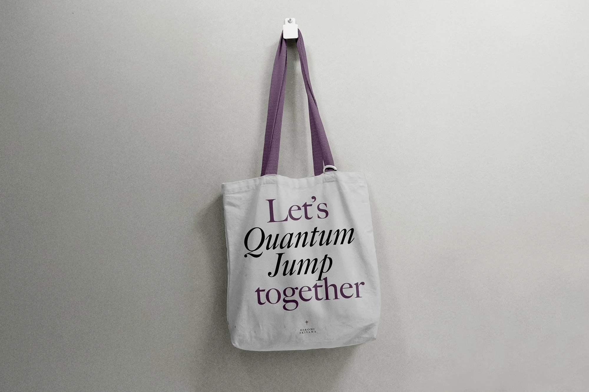
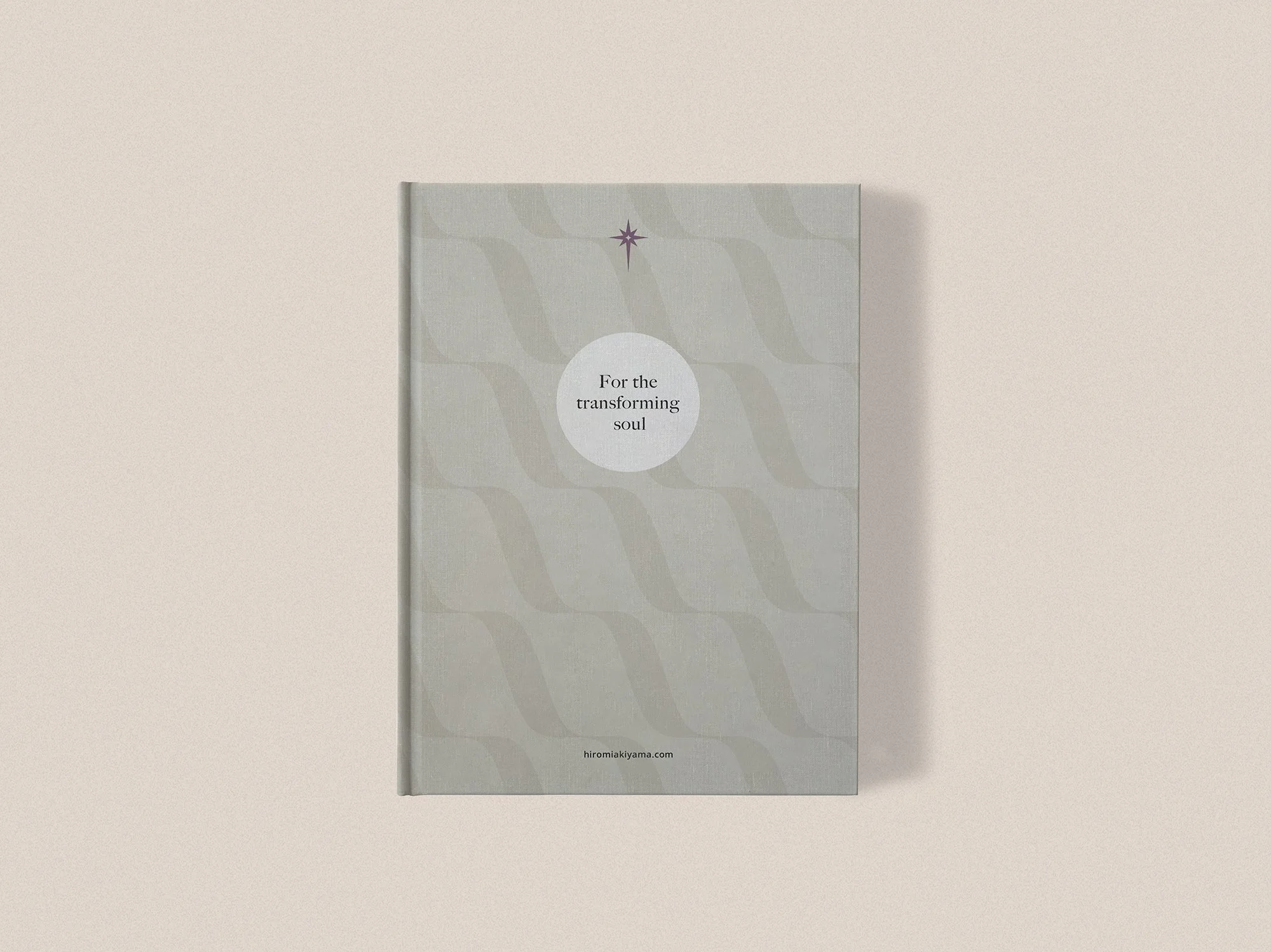
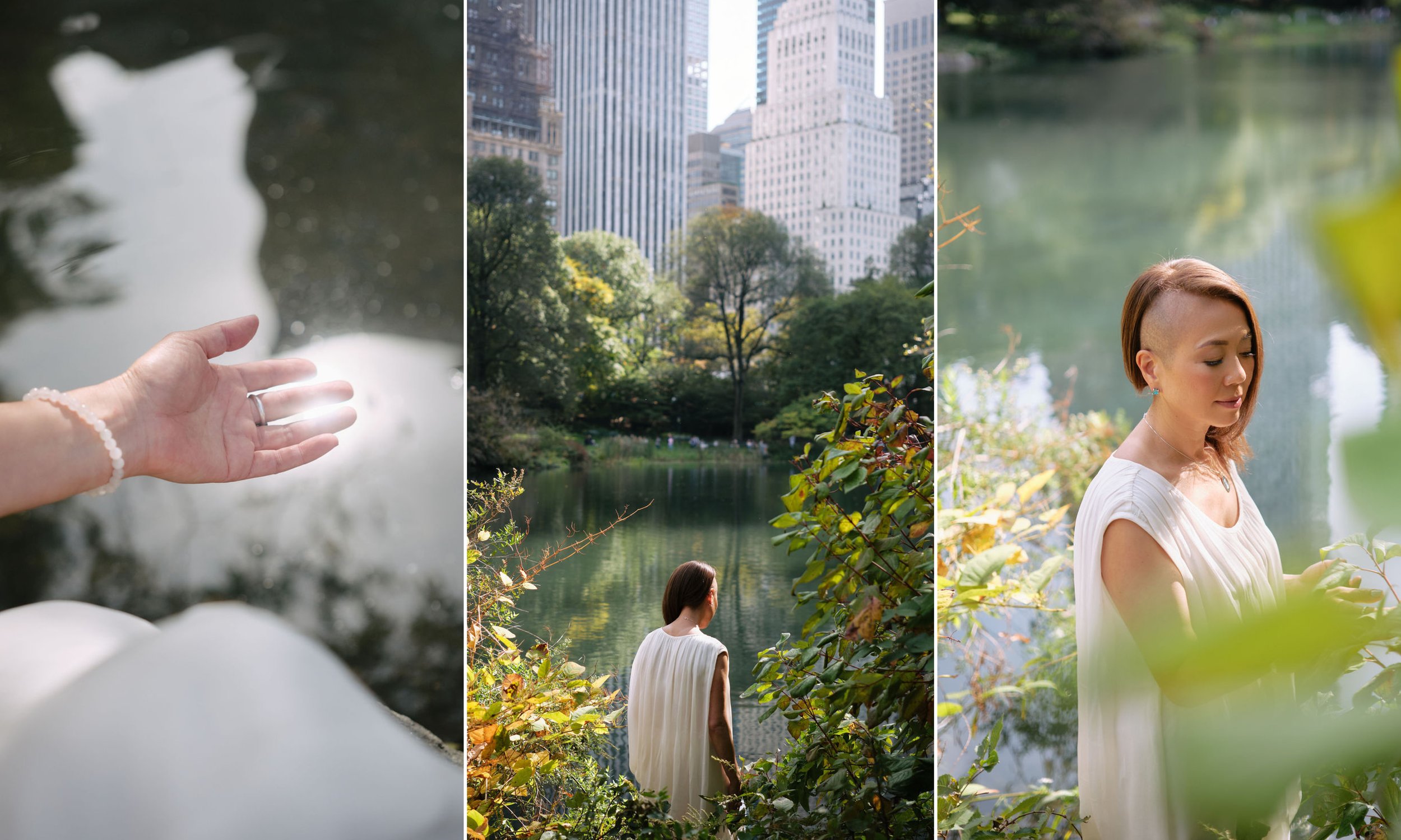
Hiromi had a very clear and specific vision from the start. She was drawn to ethereal imagery, yet needed it to speak to a more corporate world—something refined, grounded, and trustworthy.
The direction was urban, but an elevated version of it—almost like a sanctuary within the city. She wanted a sense of empowerment, curiosity, and approachability.
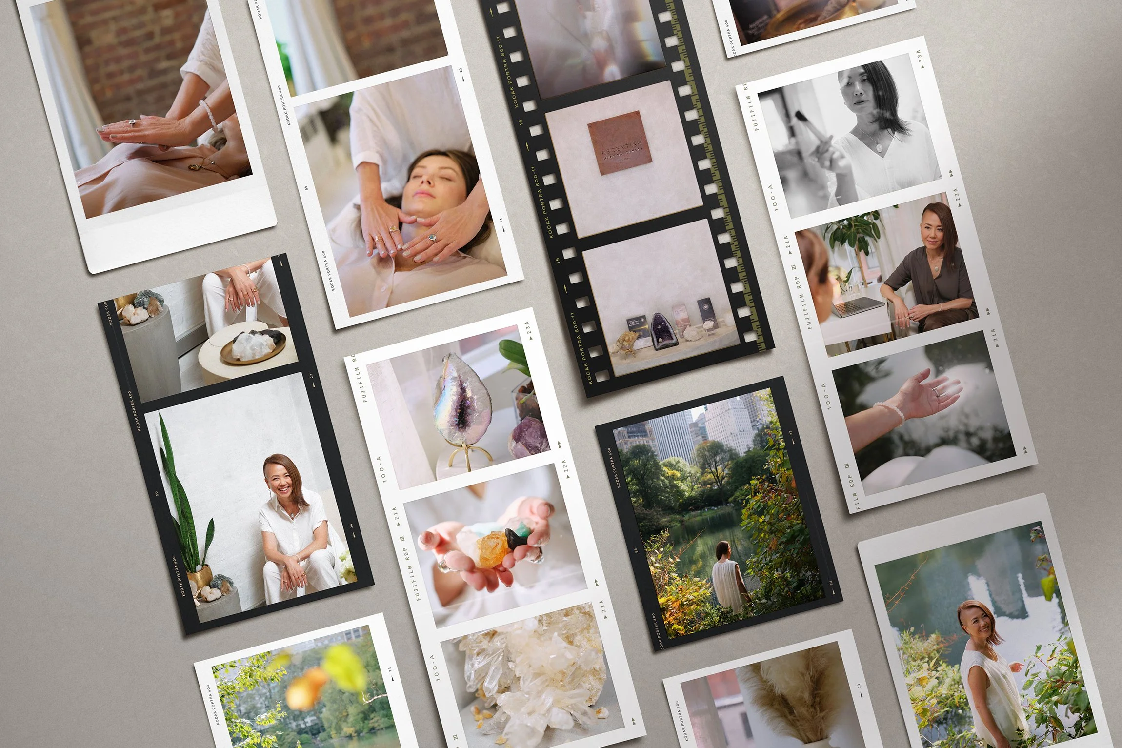
Visually, we explored iridescent tones, crystals, limestone textures, and raw, tactile materials, elements that feel elevated but not overly polished. The result is a balance between softness and strength, refinement and depth.
Other credits:
Make up: Evie Ry
Photography: Ren Mutevellioglu
Photography Art Direction: Vanessa Del Castillo
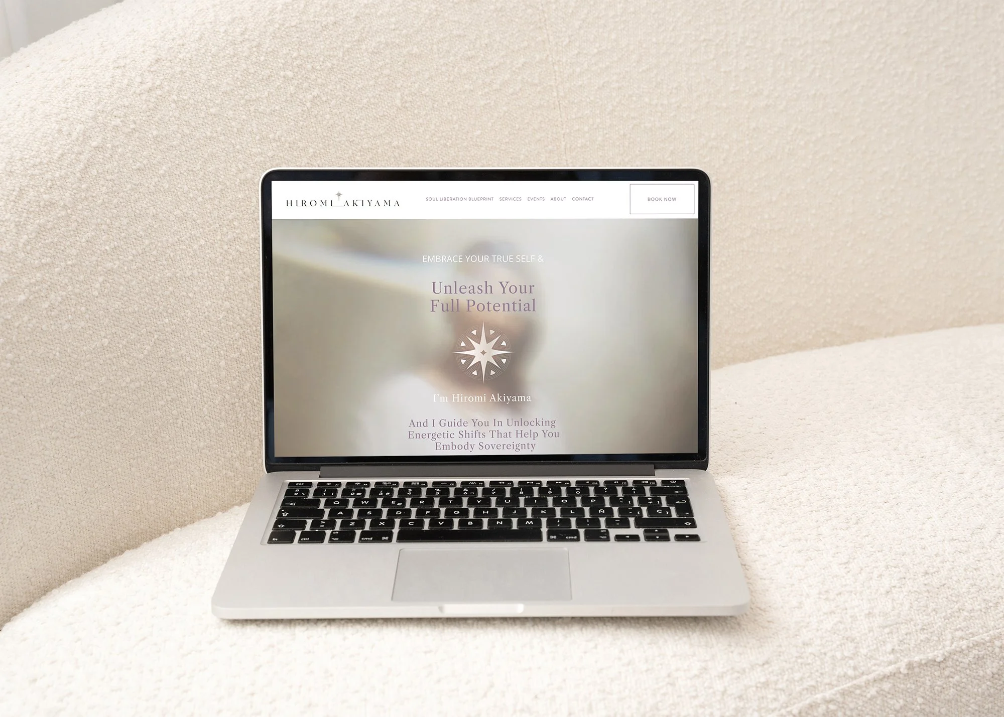
Website and social media: Website and social media managed by the client, following the brand direction.
A happy client!
-
![Hiromi desing client]()
☆☆☆☆☆
“Working with Vanessa was an incredible experience. She has a unique gift for gently drawing out your essence and translating it into a brand that feels deeply authentic and aligned. If you’re seeking clarity not just in your visuals, but in your message, your audience, and how you want to show up in the world. Vanessa holds the space for that discovery with grace and intuition. Her process is both creative and strategic, combining soul and structure in the most beautiful way. With her strong design skills, professional background, and clear communication, she truly delivers. I wholeheartedly recommend her to anyone ready to bring their brand to life from the inside out.”
-
![photographer]()
☆☆☆☆☆
“As a photographer, working with Vanessa has been a lovely and incredibly streamlined experience. Vanessa’s background as an art director and producer is incredibly helpful during photoshoots. Her branding guides are clear and her vision is beautiful and customized to each client in a way that highlights the strength unique to their business.”