✶ Brand Strategy ✶ Concept Development ✶ Custom Illustration ✶ Logo Design ✶ Brand Identity
Sara Jane wears many hats — energy facilitator, matchmaker, somatic practitioner, and stand-up comedian, just to name a few.
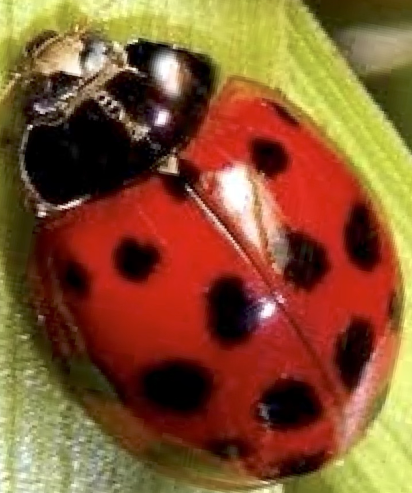
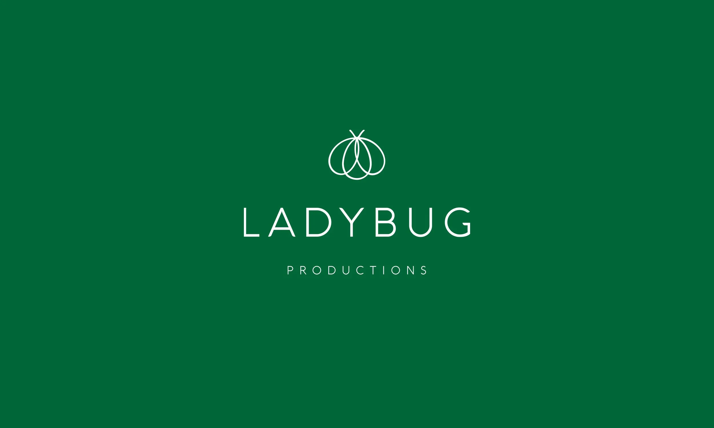
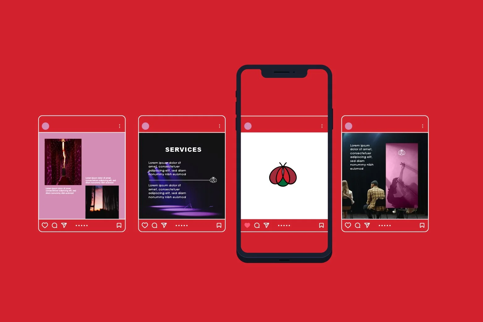
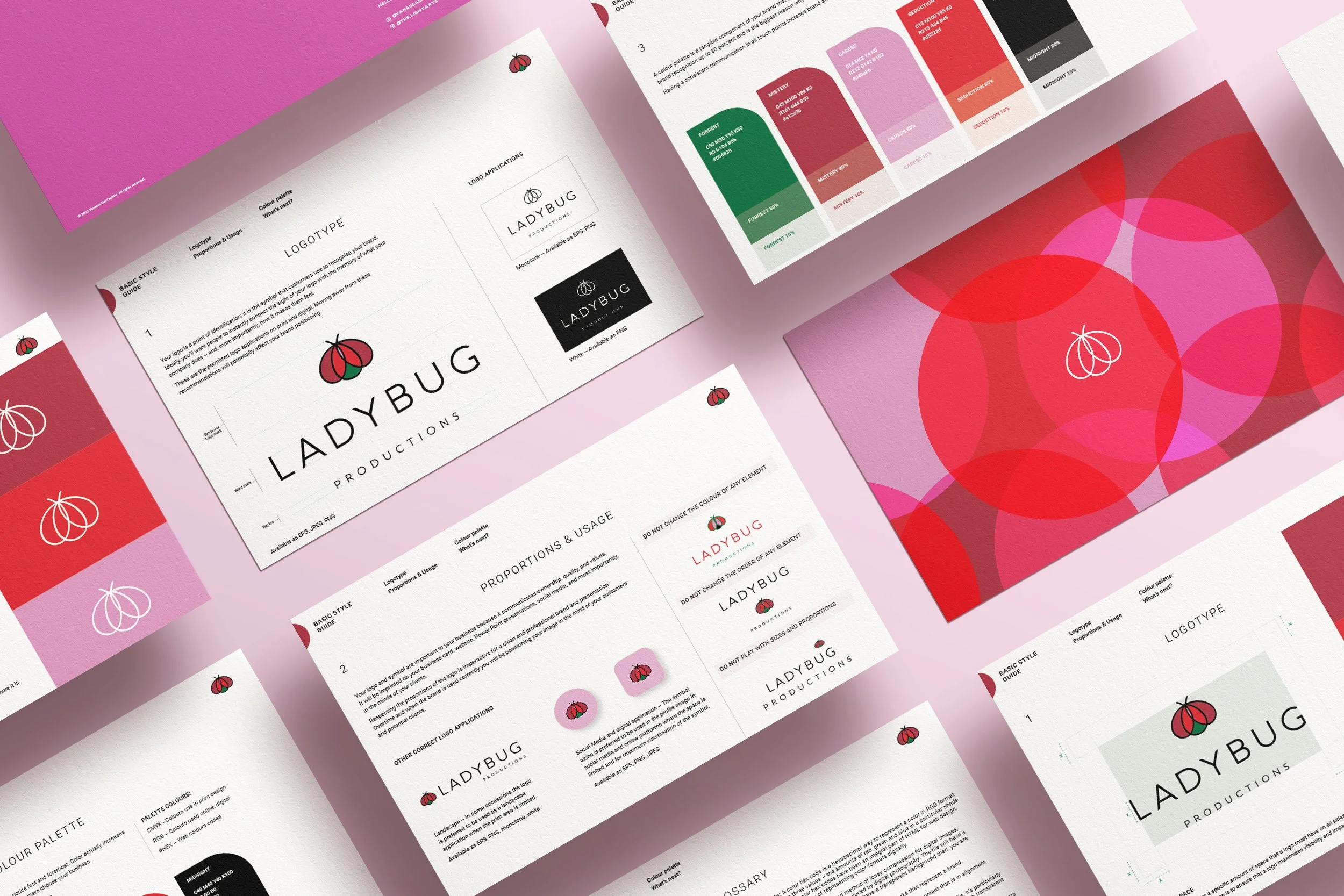
She owns a multidisciplinary conscious business called Ladybug Productions, and had been using a ladybug image as her business symbol. Sara Jane felt it was time to take this symbol to the next level—to give her brand a more professional, elevated look that could hold the full depth and range of her work.
Ladybug Productions spans: The Living Blog, Caress, Access Consciousness, Romantic Matchmaking, Independent Staffing Services, Mediation & Conflict Transformation, Bias-Awareness, Professional Writing, Art, Somatic Experiencing (SEP), Certified Moksha/Modo Yoga Instruction, and Renaissance Woman.
THE BRIEF
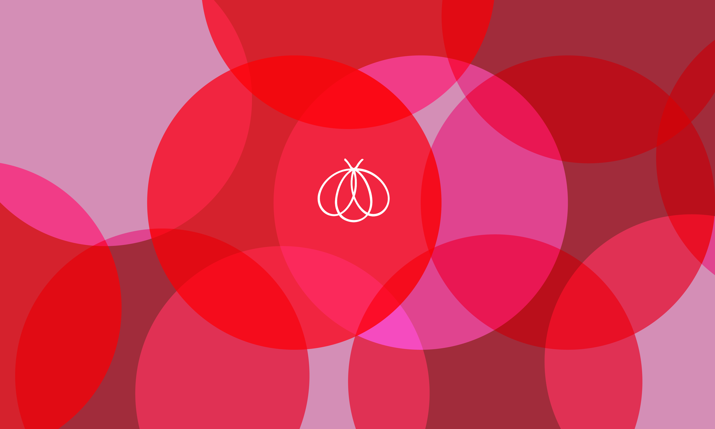
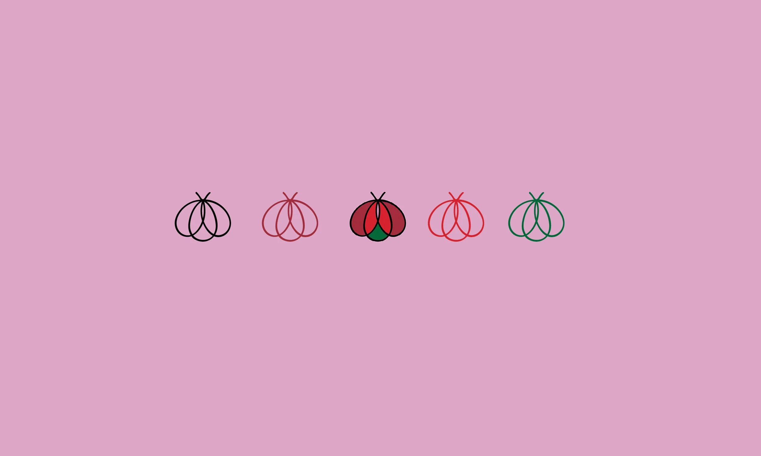
Ladybug Productions is based in NYC, a conscious business that transforms and expands as Sara Jane does. The brief was to create a logo that translates the innate nature of the ladybug: their lovely appearance and, at the same time, their fierce qualities.
The logo needed to communicate: eroticism, joy, lightness, ease, brightness, fun, attraction, intrigue, potency, and transformation, all held within a single, elegant mark.
We first connected through our shared path as Access Consciousness practitioners, a meeting that felt deeply aligned long before the design work began.
How we started
Sara Jane used to sign her communications and community updates with a simple ladybug image. This became the seed—from here, a full conscious brand identity emerged.
A logo creation
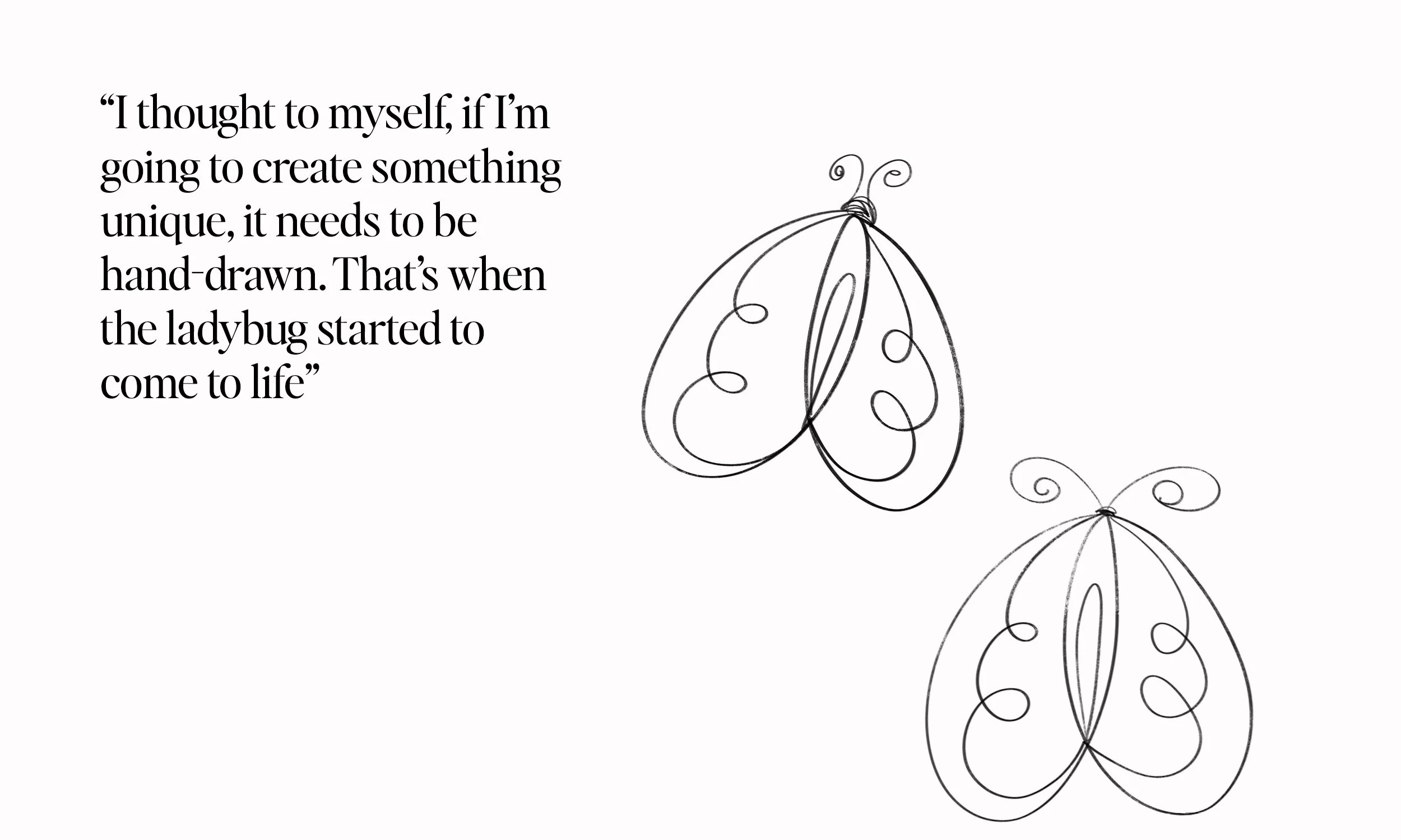
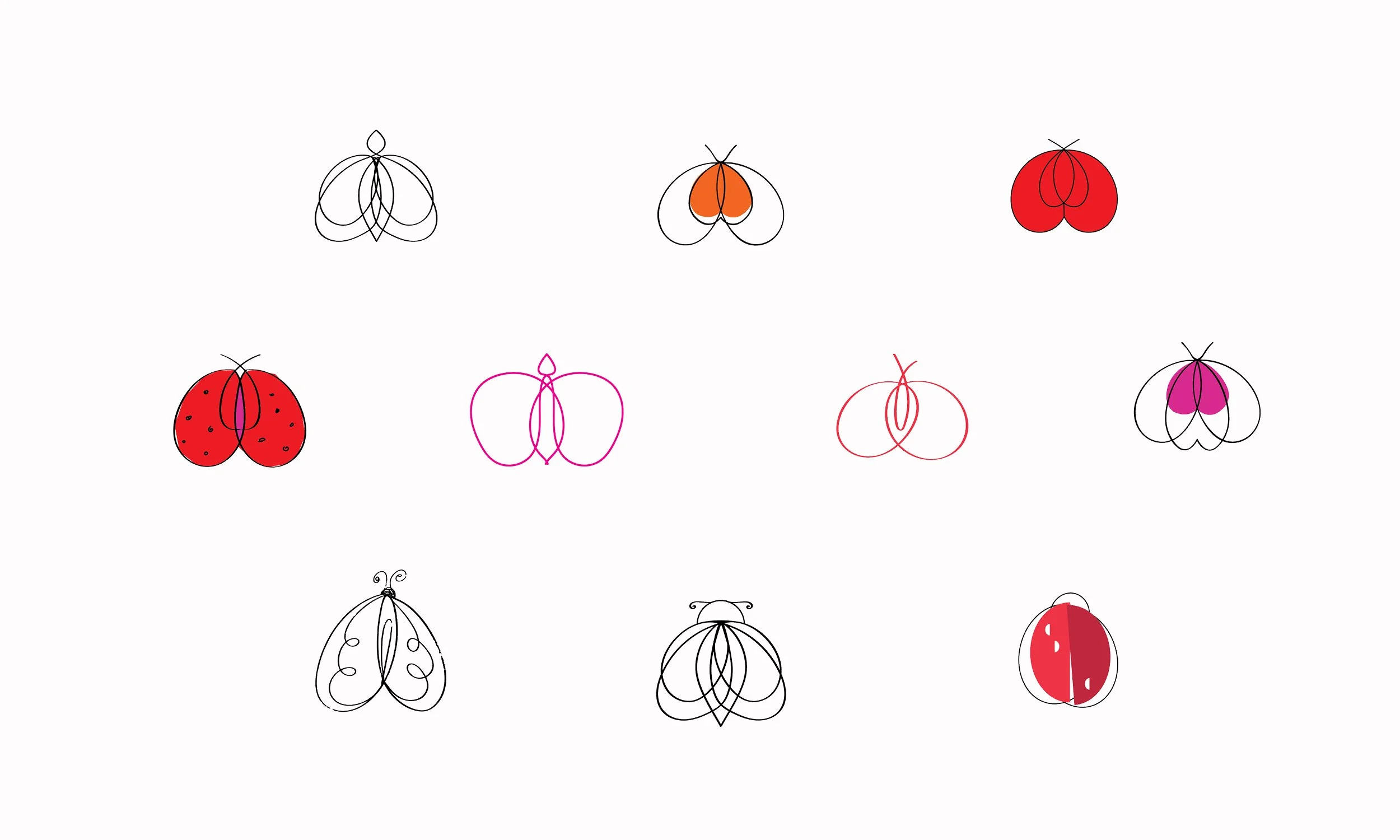
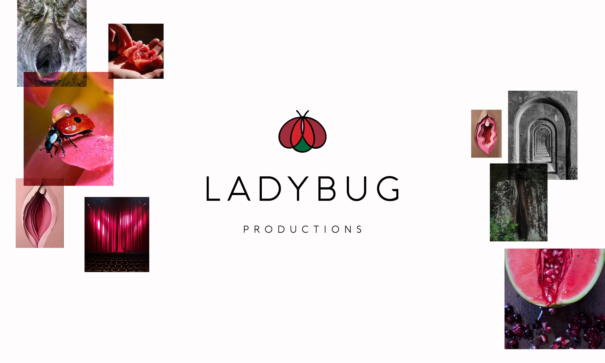
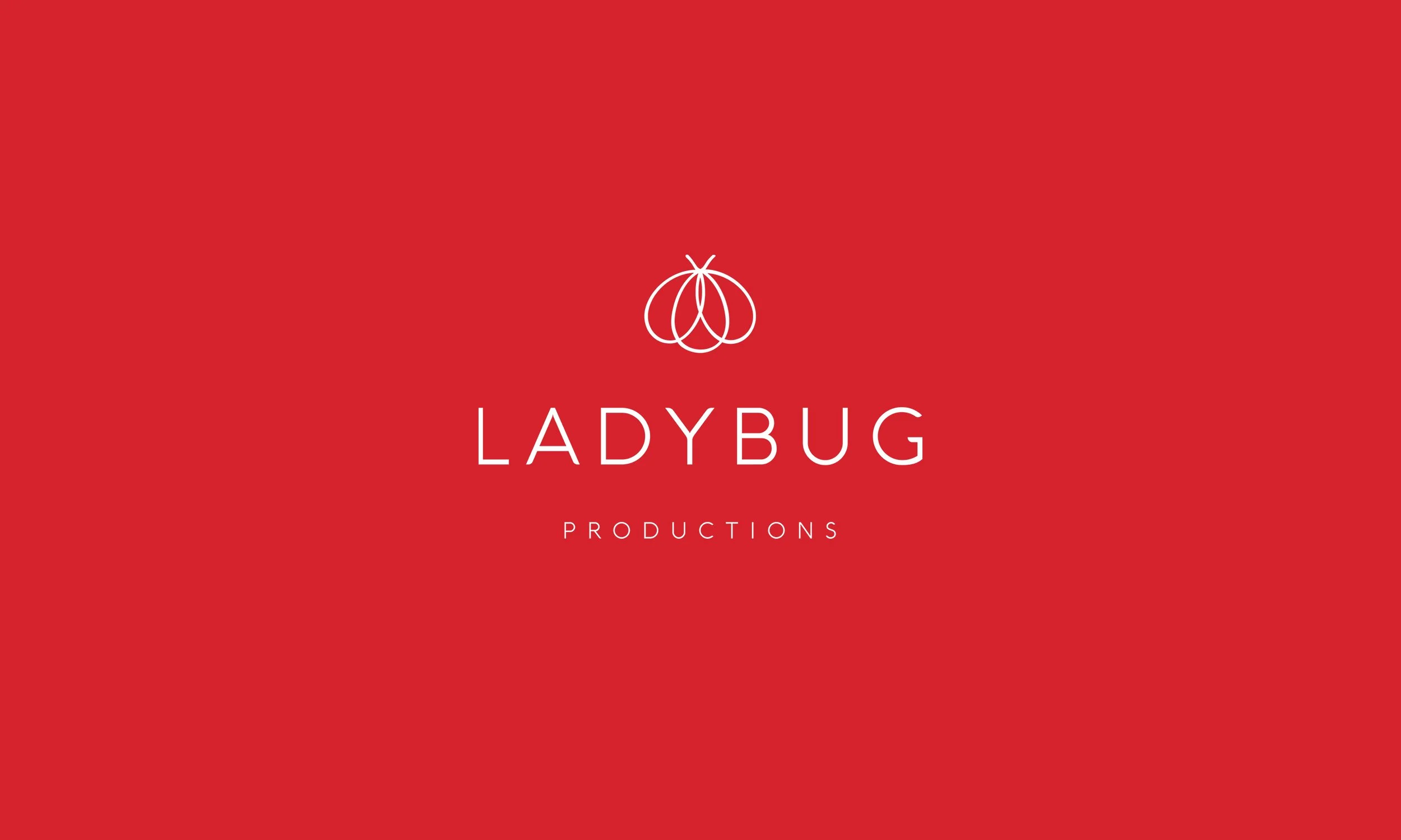
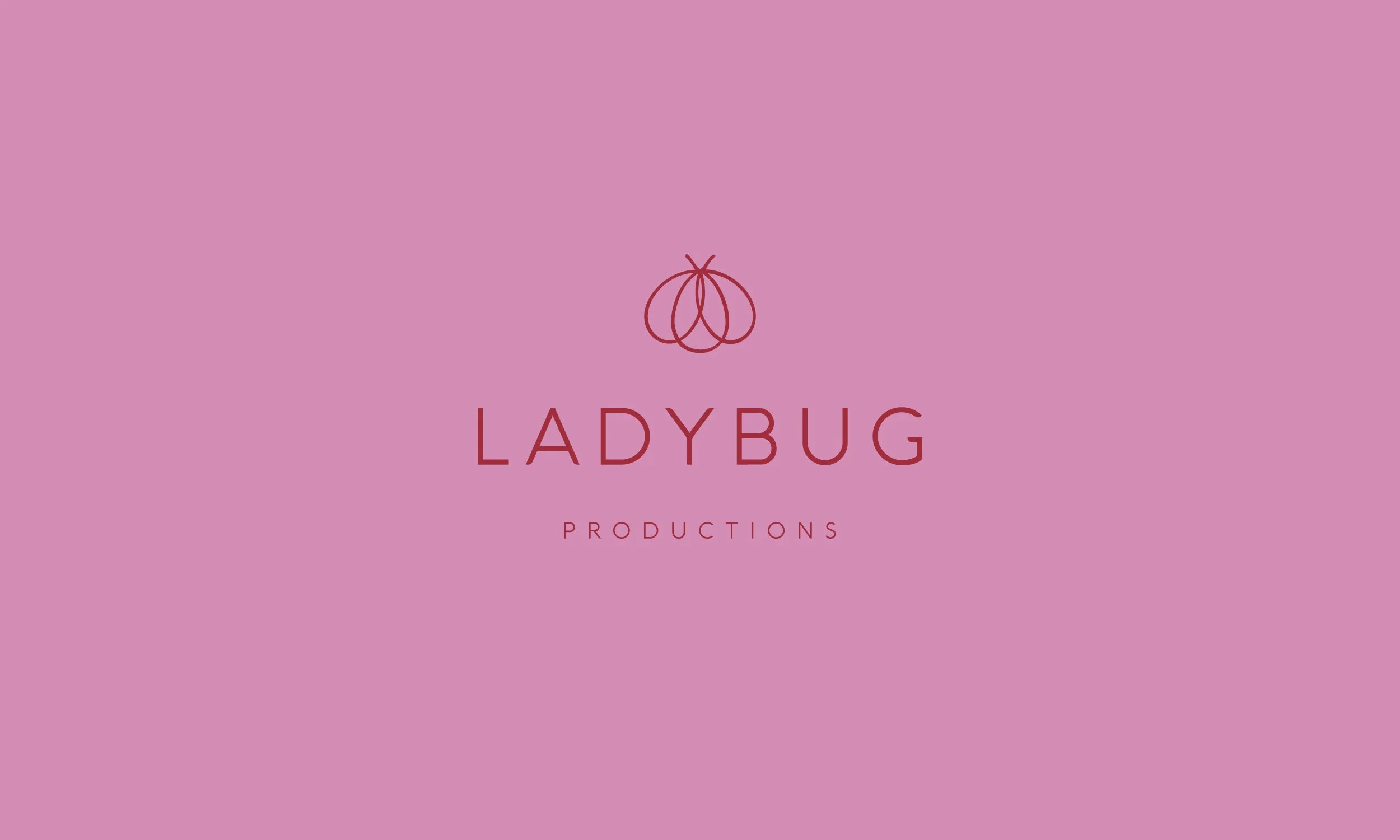
A logo was created that visually encompasses all that Ladybug Productions is: erotic, feminine, powerful, transformative, ever-evolving.
Other credits:
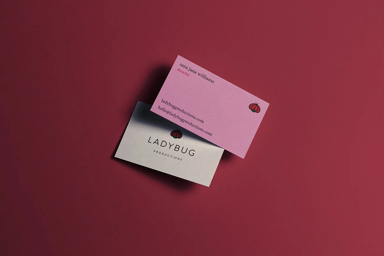
Website and social media managed by the client, following the brand identity and guidelines created by The Light Arts Design.
A happy client!
-
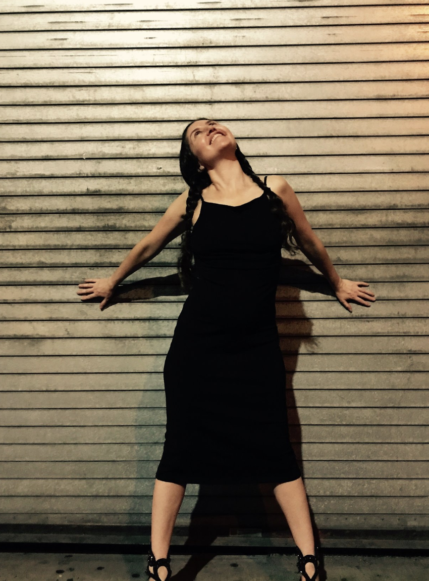
![Sara Jane Wellock — Ladybug Productions branding client of The Light Arts Design]()
★★★★★
“Vanessa is truly gifted! She tapped into the energy of the business and created an image which matches and exceeds what I am creating. In other words, the logo Vanessa made for Ladybug Productions, Inc. is multi-layered, multi-dimensional, and it it captures the past, present, and a bright future. The business has many aspects and she was able to convey so much, while keeping it simple and sophisticated. I teach clitoral stroking classes and the logo is reminiscent of a vulva. I also have an ongoing performance piece and the very same image reflects the curtain, stage, spotlight. Vanessa is smart, insightful, professional, reliable and friendly. I truly enjoy her approach and I benefited immensely from the experience. Highly recommend. She is very skilled in design and beyond. Excellent communication, respectful and forthright feedback, quality offerings. I am very impressed and grateful!”
—Sara Jane Wellock